Company

SASQUATCH SURVIVAL KITS
_____ 


Project Brief

Sender: Sasquatch Survival Kits

Audience:  Outdoor enthusiast with a centralizated focus within the camping, backpacking, and climbing communities.

Message: Sasquatch Survical Kits  “Survivce the Unknown” - Compact survival kits that aid in surviving th unknown situations (”acts of God”).
 
Objective:  Compact survival kits that actually function.  Also you will be proud to own and have with your gear.  


Reading: Section 2 - Charge It Up

Emotional Salience
It must appeal to both the eyes and affect. This will connect the brain into remembering something impacting.  Powerful imagery increases our emotional salience. Computational effects are also powerful way to express and evoke emotion. Research shows that people like emotional images rather than neutral ones. Color is the most impacting to emotions. It communicates rage, hate, love, strength, earth, etc etc etc.  


Narratives
We all love stories and a good story is one we can relate to and draw our own experience/relationship with. As a designer if we can create an effective narrative we will be able to direct our viewer to a conclusion that is in coherence with our message. This can obviously be manipulated.  If you have ever watched TV, I hope for GOD SAKE that  you have noticed that the reality is being twisted to sell a product. In a study where subjects listened to a script and were told to imagine their involvement in the scenes, the narratives triggered areas of the brain that emotionally prepared the participants to take physical action.  That's pretty damn strong if your trying to sell something.  

Visual Metaphors
When a visual metaphor succeeds, it synthesizes two objects or concepts to reveal a new connection or a deeper meaning. Visual metaphors are intertwined with our cultures.  Knowing how to tip-toe inside of a culture is a very hard thing to do and take probably a life time within a culture to be able to correctly perform this.  Juxtaposition is a strong tool to create metaphors.  Metaphors make emotions tangible.  

Novelty and Humor
Novelty must defy convention and create visual surprise.  This will create an emotional reaction that triggers attention and heightened interest.  It results when unexpected themes are brought together and when type and image seem to oppose each other.  Moderation seems to work best. 
I find humor to be one of the hardest things to nail.  Humor driven advertising/communication is one the strongest types of emotional drivers we have. Think of the Super-Bowl; Why are 99% of the advertisements fighting for 'Best Joke'.  Being able to tell a joke, to that massive of an audience that will truly laugh, is precious material.  

Reading: Section 2 - Clarify Complexity

Segments and Sequences
Segmenting complex information into bite size information is important.  We naturally segment out world daily.  It is a natural way for us to digest information.  We do this because when information is in smaller entities, it is easier to manage in working memory and easier to fit into existing schema for future storage and retrieval. Sequencing presents information in a chronological order, similar to how it would occur in the real world.  Effective for explaining a procedure, a set of steps, cause and effect, or a complex idea where one principle builds on the next.  Grouping items places them together in our working memory which will translate into our long term memory.

Specialized Views
These are extremely detailed views of very complex structures.  Views included: Interior View, Exploded Views,  Magnification, and Implied Motion. Professional and lay should be able to understand these technical display of complex parts.   

Inherent Structure
LATCH, order information by location, alphabet, time, category, and hierarchy. (Wurman)  Use this system to structure large systems.  It can be used small and large. We use it everyday on our computer or in our planners or anything. It seems to be pretty well integrated into the American society and is best represented at any library.  

Reading: Section 2 - Make the Abstract Concrete

Big-Picture Views
Arrows can be used to direct, connect, point to importance, and indicate relationships. Can depict movement or a path or conversion.  Arrows also have been converted into other symbols such as cyclic or reciprocal relationships. Big Picture views allows the viewer to enter the topic from a global scale  to understand the overall and than interact on a local scale to get detail.


Data Displays
The phenomena derived from the numbers are of most interest to people.  A pie-chart is the most common understood graph.  Graphs convey meaning through spatial positioning and relational size.  Graphs will turn up long-term memories to decipher them. A data display is effective if it provides a shortcut to the intended message, promoting visual processing and bypassing the need to make numerical computations. 


Visualization of Information
Information visualization makes a representation of complex information systems that will work not with our working memory but will expand the way our brain can comprehend things like time and space.  


More than Geography
Today most of our maps are not topographical.  We really don't use those in our society anymore.  I bet 1 out of a 100 have ever used one.  So we as designers are making maps that are more engaging and speak a certain language to the viewer.  Think Disneyland, all you want to know is how to get to Space Mountain as fast as you can so your map must be easily understood.  This is accomplished by correct vantage point, graphics that represent the terrain and relevant imagery, landmarks, choice of typeface, and use of symbols. 

Snapshots of Time
This is any visual representation of time.  Most commonly known as the timeline. Seen in our textbooks since we have grown up.  Representing the WWI or the evolution of the Universe. They can be as precise as we want to as vast as we want. As designers it is our goal to transfer a straight line with dates to an experience of time evolving as a story is transcribing. 

ON AIR


 Critique - Cole 
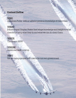
I think that chem trails is a good p.o.v. for the On Air Infographic, considering that a large part of the audience lives near Hill Air Force Base. I think that showing the effect that chem trails can have on our bodies, homes and in our sky can be very eye-opening tool for the audience. I also think there is a lot of potential in having the actual smoke of a chem trail create the typography of the title.

Somethings to consider:
- Layout Revisions: I know that this is just a rough sketch, but I think that the hierarchy of the composition should reflect your body, house and sky concept. You might want to consider a vertical 3-tiered layout showing different statistics at each level.

Response 
Thanks Cole! That was my initial intention to address all of those issues. I didn't think it was possible until i saw where we could hang and how big we are planning on going. I'm glad I have a big enough means of communication to talk about a 3-tiered approach: sky, home, body. I think it will be an easy way to keep the viewer flowing from top to bottom and back.  


This is a great documentary about Chemtrails. Worth watching even if you don't find yourself an 'environmentalist'


Pre-attentive Visual Processing Analysis


Talisman Bike Gear


Pop Out
                                                                              

Grouping
                                                                              

Texture


Reading: Section 2 - P3 - Reduce Realism

Visual Noise
Minimize visual noise by reducing extreme variations in texture. Flat areas of colors with a non detailed background works well.  
Visual noise can add realism but be careful because that can lead to confusing if not closely controlled.  Cleaning up an image is occurred when you remove enough realism from an image that the image is still perceived real.  Think utopia or pristine. 

Silhouettes
Silhouettes are a great way to establish figure-ground relationships. This can be used to establish hierarchy.  Applying a silhouette will usually require a b/w relationship with the background, built between contrasting values or colors.  Some detail to the figure is important to establish what it is; A man or a bear or a goat could make a big difference in communication.   

Iconic Forms
Icons are still a learned language. We learn together as a society just as we choose to learn the English vocabulary and not the Spanish. They can help use designers immediately indicate the function or role of an object or area or contents (etc..) They are effective in signage, maps, technical displays, catalogs, diagrams, and graphs.

F-ing ICONS! Love to hate them hate to love them. They can be such a useful tool but sometime they can be used very tacky. Icons are great because they are universal. I wonder what our visual alphabet as a combined world is? 

Line Art
Line art is an even more simplified version of a silhouette, sharing qualities such as detail while filtering out irrelevant information. Line are sometimes can be more effective as a primary image.  It has more potential for displaying emotion, ideas, or the object.  They also abstract the realism by providing all the necessary detail and omitting anything superfluous.  
Quantity
The quantity of images can directly reflect the hierarchy we as designers are communicating.  Reducing quantity of images within a message can create visual impact/importance. Subtracting elements of a design until its skin and bones can work. 

Reading: Section 2 - The Principles 2

2) Direct the Eyes                                                                                                                                              

Using hierarchy, we as designers can control the movement of our viewers eyes. As we extend our audience's eyes we will construct a direction of information that the eye will determine as most important to least important. 

"Purposely directing the eyes makes it likely that a viewer will pick up the most relevant information" 

 
Applying the Principle
                                                                                                                                          

Building a complex graphic will have to 'connect the dots' for the audience.  Making bold contrast between information will help determine where the eye should travel from information to information.

Position
                                                                                                                                            
Standard Visual Hierarchy: primary, secondary, equivalent

The way in which we position an object with directly affect how we perceive its importance.  If an object is at top, than it is probably the most important. As the eyes moves downward the information naturally become less important. 

"Varying the position of an object in a frame changes its impact on the observer."

Emphasis
                                                                                                                                            
Creating contrast is the best way to show that an object deserves emphasis over other.
Contrast is created by differencing elements such as: size, tone, color, texture, and shape.
 
"Our interest is heightened as we attempt to mentally accommodate an unusual juxtaposition"


Visual Cues
                                                                                                                                            
Visual Cues:  arrows, color, and captions to a graphic.
These are easy indicator that we all recognize as symbols for direction to important information. 

"Visual cue pointing to a target increases the perceived visual area."

Natural History Museum of Utah